Hi, I thought I would share some tips- or at least a general idea of how I work. I've been posting something on my gallery every day for about 12 days now, and I've learned quite a few things.
So today, I'm going to work on a trippy shot for a lil project made of scrapped Gondola ideas. None of the images I created were substantial enough to make a full length thing. I wanted to collaborate on it, but it hasn't been going so well, so I thought I'd just document what I'm doing for this one shot as I go along. The finished shot won't go up on my gallery, but it'll be on my art thread, which I'll post at the bottom.
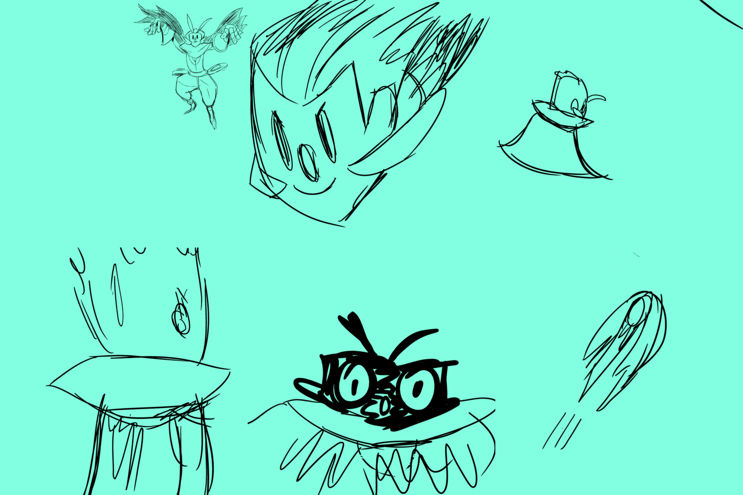
So, here's the layout for the shot:

If you can't tell, it's a nightmarish image of gondola.
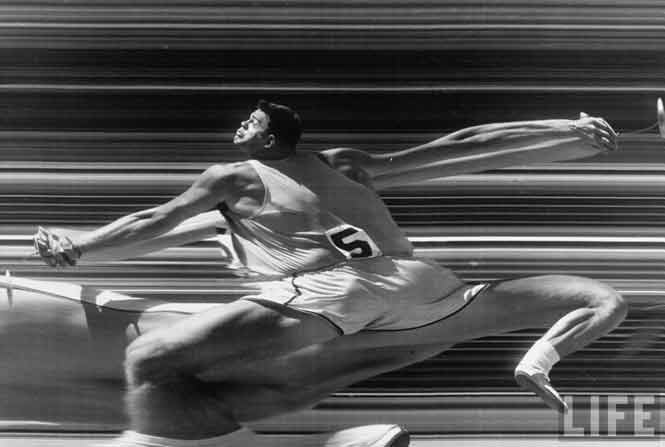
So, first thing- the background. I knew I wanted something based around slit scan photography- this

Essentially, it's when a small portion of an image is "stretched" due to a camera lens being covered with a slit over it. The most commonly known artistic use of it is in Kubrick's "2001"
I found a lot of useful information while researching this method- most of which would need a whole post dedicated to explaining. But a video I found demonstrated an easy was to dupilcate the slit scan technique by putting a "time map" on a video in after effects:
https://www.youtube.com/embed/YCZ3MqXOfYQ
He mentiones that you can actually animate this time maps- meaning that I can actually mess around with time using animation.
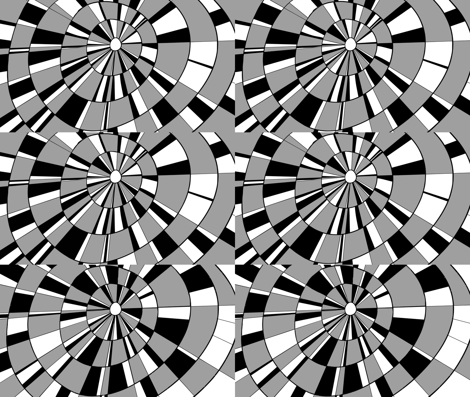
So, I created a trippy animation using two frames that alternated. It took longer than it should have (I didnt use photoshop, I used toon boom like the fag I am, therefore taking much longer) but it does what I need it to:

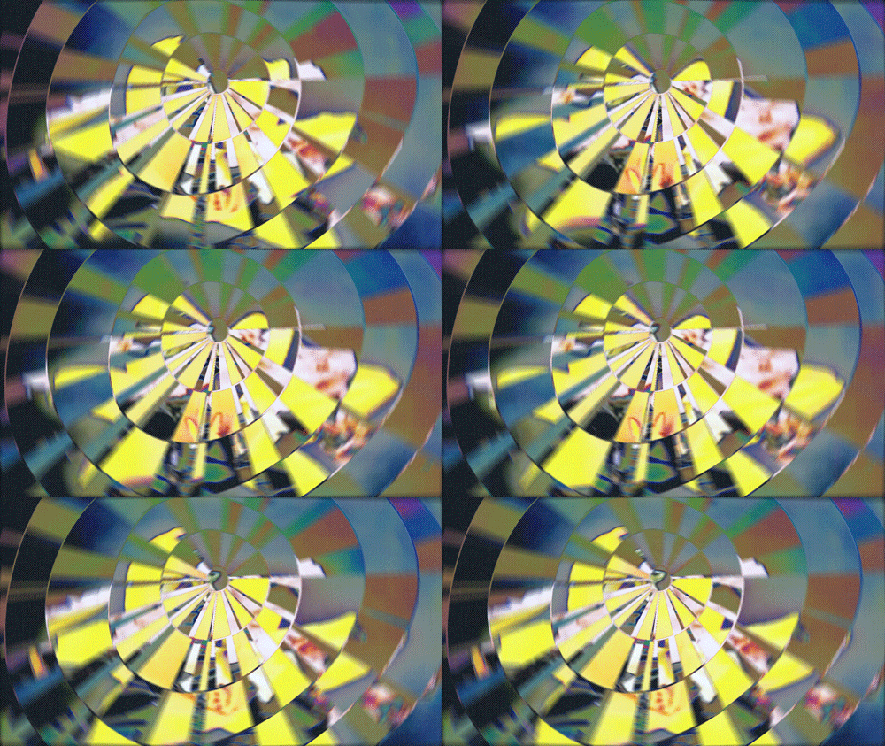
Then, using the method in that video, I found a bunch of really old flower timelapse videos, changed their framerate to 60fps in vegas, and with a lot of gpu melting, I ended up with something like this (not the whole thing, obviously):

So, that's the background kinda done.
Next is the actual animation on top.
I use a student version of creative cloud, and it fucking sucks- stick to pirated versions, they lag less, don't uninstall themselves and can be moved from pc to pc. I'd post a link, but I can't remember it...
Anyway, I'm using creative cloud photoshop to animate this purely to see what the differences are.
I set my shortcuts up the same way Alex Griggs does, who explains the process a lot better than I do: https://vimeo.com/80851591
But if you want the condensed version:
-Set up actions so you don't kill yourself.
-You're not going to be animating fucking Pinocchio in this. It's photoshop, work within the limits, and work in pieces.
-Use everything photoshop has to your advantage. Otherwise, there's no point using it- go back to flash. Filters, fancy brushes, layer modes, masks- CC even has keyframes.
-try to keep your method as close to animating on anything else, then branch out and explore- it's a lot faster than muddling around and slowly getting to grips- it's not really that kind of software, I find- it's not suited for animation.

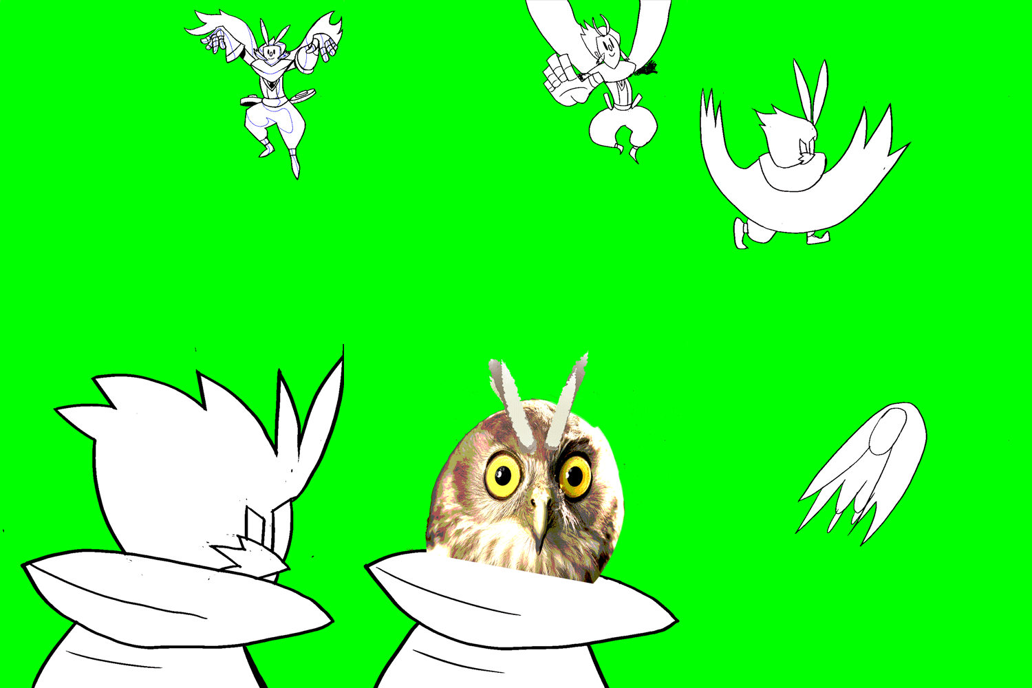
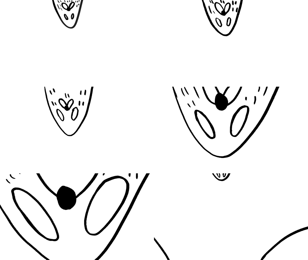
So heres the basic animation. Servicable for what I'm doing. I left the alpha in to demonstrate something that most people reading this might use in flash all the time- the fill tool. If i blocked in these frames using the fill tool, these white lines- which were created using my brush would stick out, like this. This is because this is a raster based program, and the reason we can use all our fancy brushes.
If anyone bothered to actually watch the Alex Griggs video, he sets up a quick shortcut to color his frames. However, I didn't like it too much, it doesn't offer as much control as I'd like. For example, Changing the line colors would be a drag using this method, and you'd need a pretty good way to organise your layers. I'm an unorganised nigger, so I found another way.
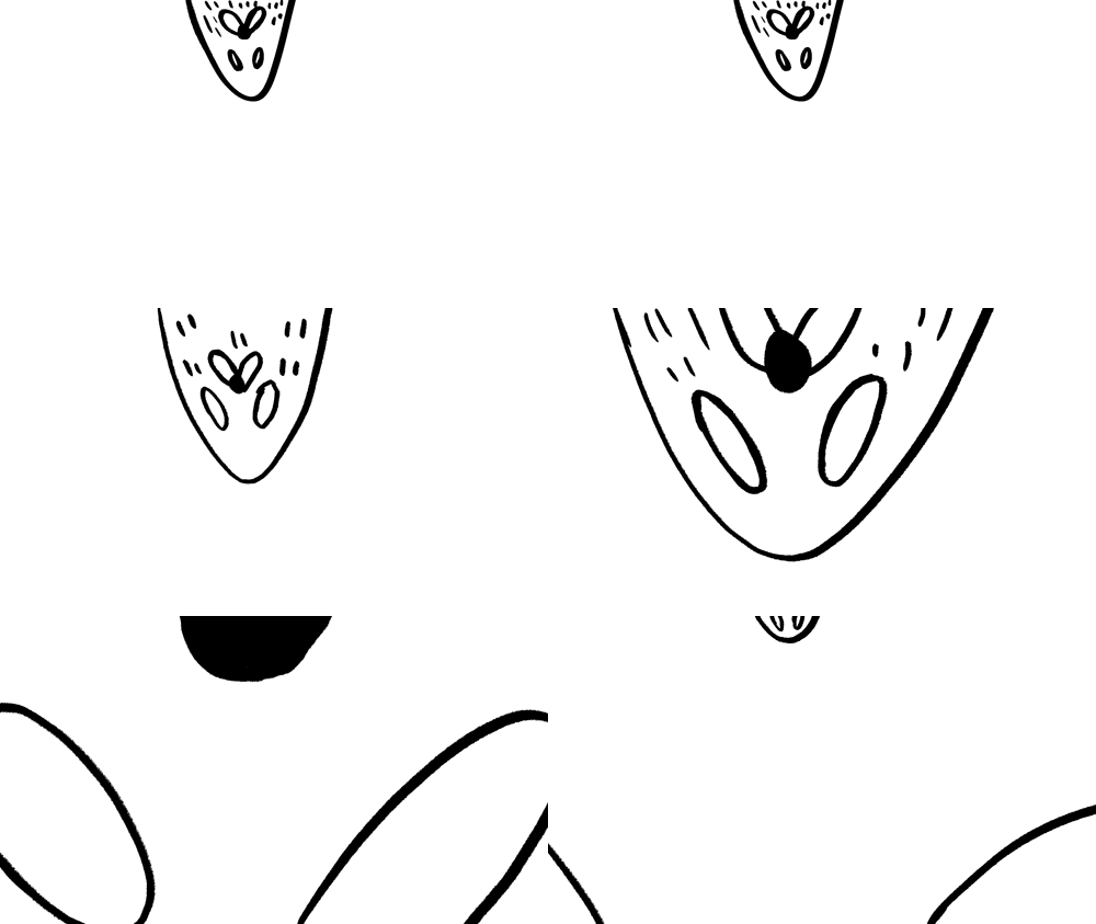
The way i'm using isn't "better", but it's much more of a manageable solution. First of all, you want to get rid of your anti-aliasing. The easiest way to do this is set up your lines against a white background, and set up a contrast/brightness mask, and turn the contrast up to 100. Make sure you tick the "use legacy" box, though I have no idea what it does, it just works

Anyway, it'll look like this once you render it:

If you look really closely, you'll see this:

Looks like Yoshi's Island, doesn't it? That's because it's aliased. This means that we can safely fill these spaces in with the fill tool, and do whatever we want with the colors. I exported it as a PNG sequence, but I think you could try other methods.
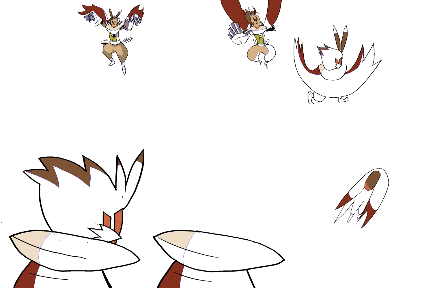
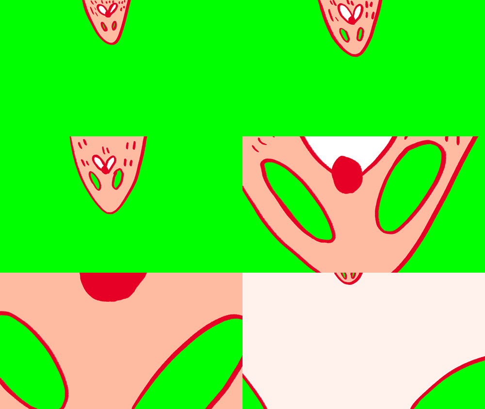
After importing this back into photoshop, you'll have it as a video layer, preferably. Then, just take your fill tool and fill those tight lil gaps with your creative juices. You'll very quickly produce something like this:

You'll notice the gondola skin fades- that should be the transparancy settings with the fill tool. You'll also notice the green- which isn't really that necessary for something so short like this, but I'll show it to you anyway. You'll also notice that it still looks like Yoshi's Island, all bumpy and aliased. Which you may like, but I need to smooth it out to look like the original lines.
The secret is this addon for photoshop: http://olm.co.jp/rd/technology/tools/?lang=en
The OLM smoother basically smooths out your pixels, and also color keys out a single color- in this case, it's the green. Very useful if you have white in your character models, making moonman proud.
It has a tutorial inside the file itself, anyway.
If you don't feel like having addons, you and use its equivalent in after effects, although I haven't tried it yet. Or, you can just remove the colors yourself with the wand tool, then apply a slight gaussian blur. It takes about the same amount of time, I think.
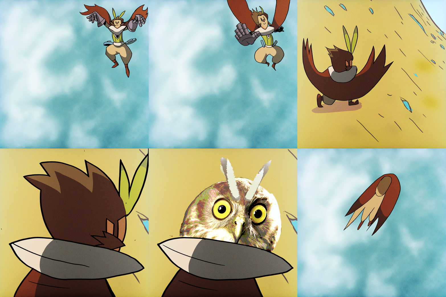
So, it now looks like this:

There, it's just like the first one- those juicy antialiased lines are back. Now, I just combine it with the footage in after affects- and here we go.
https://youtu.be/OwwXO6xy5vk
Any questions or suggestions are welcome- it's not perfect, and this definately needs cleaning up. But that's the basics.
Glad to help
